The Niles Wizard is a guided 3-step onboarding flow that helps users customize and launch their app instantly after submitting a prompt. It automatically suggests the right pages, layout, and theme based on the generated project — making it simple to go from idea to working app in under a minute. The purpose of the Wizard is to help the AI best understand the needs and requirements of the app and to get whatever is required right from the start!
Overview
When you create a new app in Niles, the Wizard launches automatically. It walks you through three easy steps:
- Suggested Pages — choose which auto-generated pages to include
- Navigation Layout — pick how users will move between pages
- Theme Selection — apply a visual style to your app
At any stage, you can skip customization and “Just run my prompt” to immediately generate the app using the defaults.
Step 1 — Suggested Pages
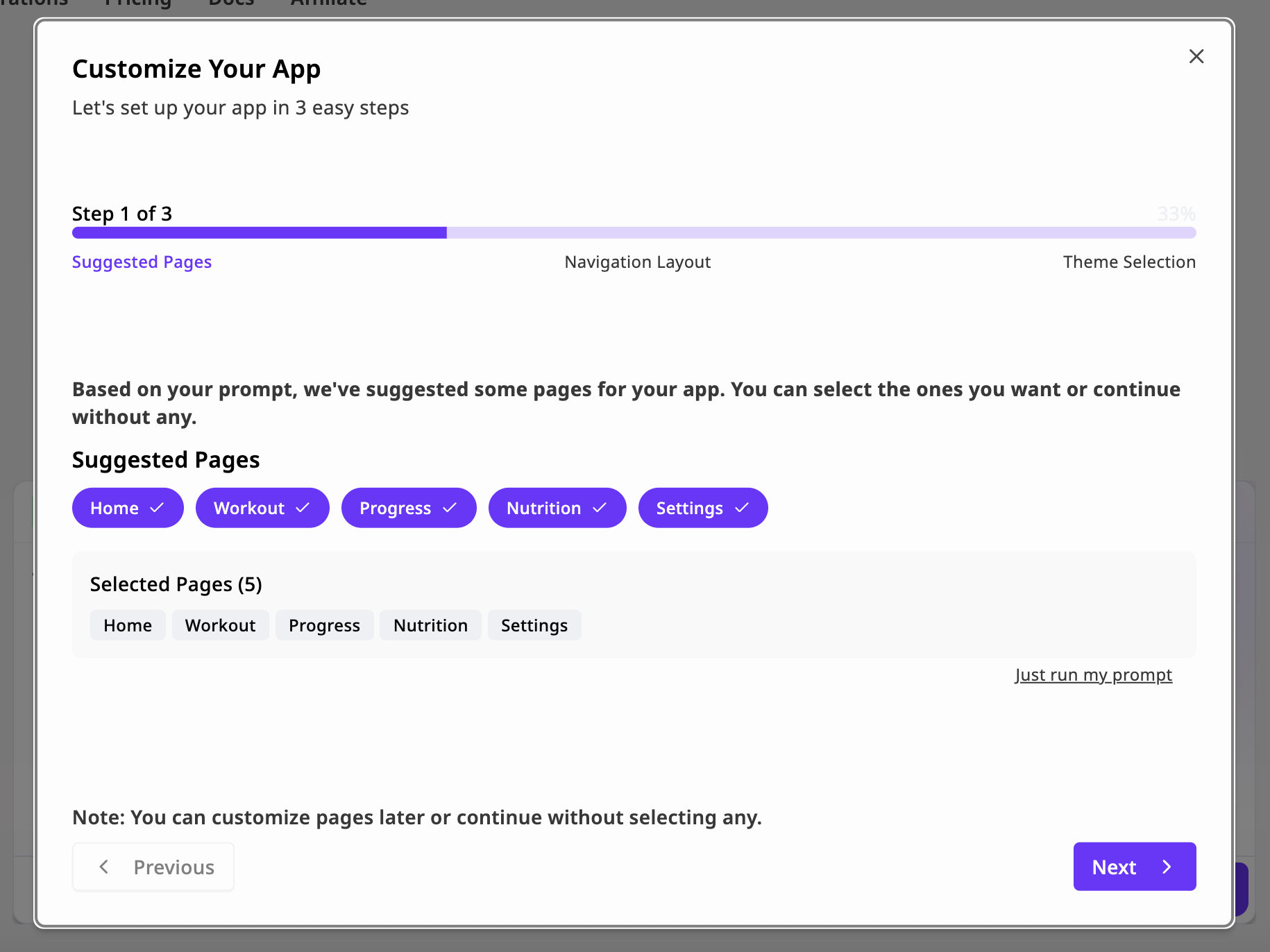 Goal: Define your app’s structure.
Based on your initial prompt, Niles suggests a set of relevant pages (for example, “Home”, “Workout”, “Progress”, “Nutrition”, “Settings”). Each page is preconfigured with layout and content suited to your app type.
You can select or deselect suggested pages, add custom pages later via the Editor, or remove pages that you don’t want to include in your app.
Goal: Define your app’s structure.
Based on your initial prompt, Niles suggests a set of relevant pages (for example, “Home”, “Workout”, “Progress”, “Nutrition”, “Settings”). Each page is preconfigured with layout and content suited to your app type.
You can select or deselect suggested pages, add custom pages later via the Editor, or remove pages that you don’t want to include in your app.
Tip: You can always edit or rename pages after generation.
Step 2 — Navigation Layout
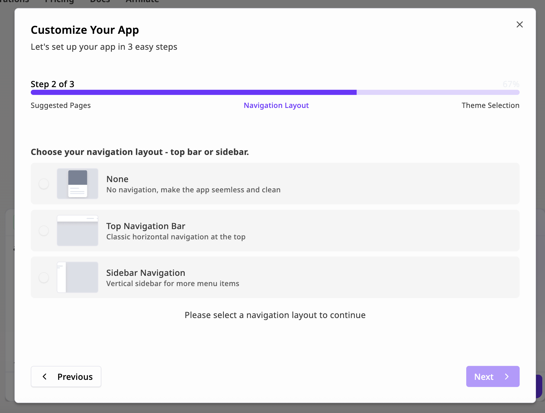 Goal: Choose how users navigate your app.
You can select between three layout styles:
Goal: Choose how users navigate your app.
You can select between three layout styles:
| Layout | Description |
|---|
| None | No navigation. A clean, single-page flow — ideal for focused experiences or landing pages. |
| Top Navigation Bar | A horizontal bar at the top. Great for apps with 3–5 core pages. |
| Sidebar Navigation | A vertical menu on the left. Recommended for dashboard-style apps or multi-section tools. |
Step 3 — Theme Selection
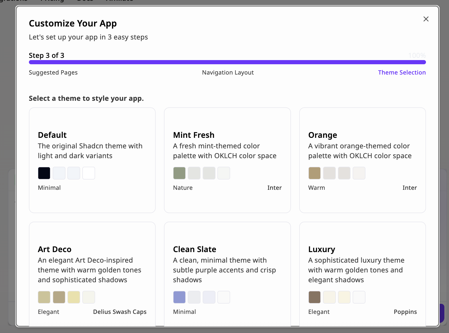 Goal: Choose the look and feel of your app.
Select a predefined theme from Niles’ built-in style library. Each theme defines its own color palette, typography, and shadow system, powered by OKLCH color space for consistent brightness and contrast.
Goal: Choose the look and feel of your app.
Select a predefined theme from Niles’ built-in style library. Each theme defines its own color palette, typography, and shadow system, powered by OKLCH color space for consistent brightness and contrast.
You Can always change and modify the theme and design using the design Theme tab at the top of the chat.